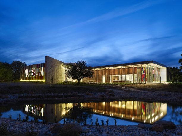
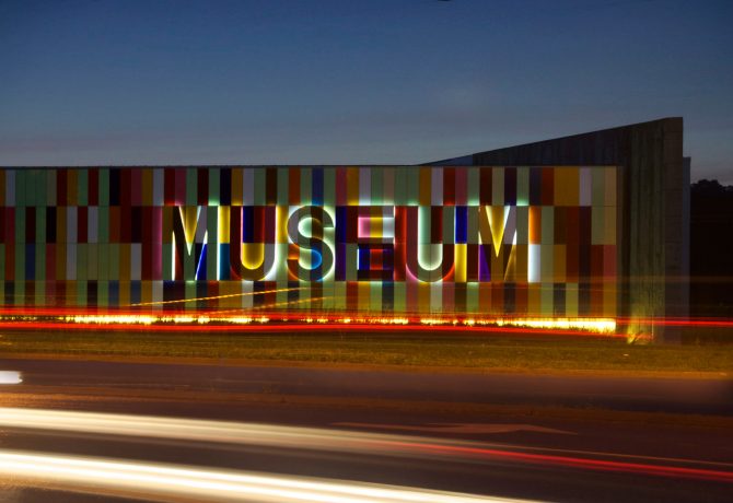
Placed at the intersection of two historic transportation routes, in Kitchener, Ontario, the Waterloo Regional Museum has become an iconic building for the region. Its bold and vivid glass panel facade, or "quilt wall", refers to the the quilts woven by Mennonite settlers. This museum specifically celebrates the past and present of its region like no other museum we've seen before. The attention to detail and sensitive selection of materials is beautiful and fascinating to experience, as it all an architectural celebration of the site's rich history.
Museeum had the pleasure to interview lead architect Brian Rudy of Moriyama & Teshima Architects who took the time to really familiarize us all with this outstanding museum. One thing we can assure you is that the more you get to know the project, the more it will enchant you.
How important was the site’s history in your design approach?
Hugely important! The heart of the building is situated on the exact physical crossing of two historic transportation routes that were significant to the development of Canada and the Region of Waterloo: the Old Huron Road that was built in the 1830?s to bring settlers into the region and beyond; and the Berlin/Galt rail line that provided a transportation & trade link between the distinct cultures of the various Townships within Waterloo Region. This “crossroads” serves as a design metaphor for the crossing of cultures throughout the Regions history, which manifests itself in the multicultural reality of the present day.
The Huron Road axis is aligned with the main public entry to the museum and creates a processional experience from the entrance up to the main lobby, and beyond into the exhibition galleries. The experience is meant to transport the visitor out of their daily lives into the story of the region - from the first nations peoples, to the early European settlers to the industrialization of the 19th and 20th century, to the high-tech of the present day.
Beginning the journey, there is a first nations sculpture at the main entry called “His Messenger – Our Prayers” by David M. General. Continuing into the building, the wood columns along Huron Hall are meant to evoke the post and beam construction of the early Mennonite barns, referencing the agricultural roots of the region. The 7 spaces between these wood columns are symbolic of the 7 parts of the region - Cambridge, Kitchener, Waterloo, North Dumfries, Wellesley, Wilmot, and Woolwich. Printed in a continuous line on the exterior glazing of Huron Hall are the names of all the historic towns and villages of the region.
As visitors ascend the gently sloping floor of Huron Hall, they can view a small triangular pool, and a waterfall, which cascades gently down to a naturalized pond. This water feature symbolizes the importance of the Grand River to the First Nation peoples as well as the first European settlers to the region. The pond also serves as a storm water retention pond, capturing water from both the site and building rooftop and using it for irrigation as well as building grey water systems.
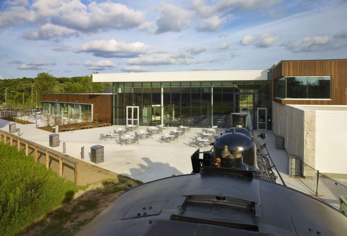
Visitors move into the main lobby space at the exact crossing of Old Huron Road with the Berlin/Galt rail line. Stepping from the wood floor onto the stone floor of the Lobby references the shift from early agrarian roots of the Region to the industrious factory builders of the next generations, brought on largely by the introduction of the railways. At the crossroads, a section of the train track is revealed under a glass floor, and a skylight directly above connects the visitor to the sky and the movement of the heavens.
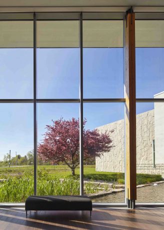
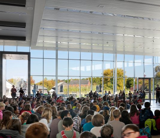
The north facing glass wall of the lobby frames an expansive view of the historic village of Doon, integrating it into the museum experience as a ‘living exhibit’ and natural outdoor extension of the museum program. The lobby spills out into a large events terrace, which connects to the village beyond.
While designing the Waterloo Region Museum, how much more sensitive were you to choice of material and color? Taking into consideration the history and environment.
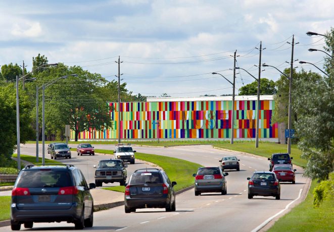
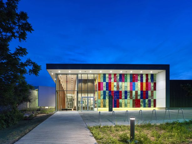
Material and color selections for this museum were quite influenced by the history of the region, and the specific conditions of the immediate and surrounding site. The front of the museum faces a busy arterial road that connects the region to the main cross-provincial highway 401. As a result, this facade gets a quite bold billboard-like treatment with a large sweeping volume clad in multi-colored glass (see more detailed explanation below). A large “MUSEUM” sign is attached to the colored facade, which only becomes readily visible at night when back-lit.
The rear facade of the museum faces the existing historic Doon Village, and so is treated more sensitively by breaking the volumes down into smaller scale masses, with natural stone and wood cladding to complement the historic houses and barns within the village beyond.
Tell us more about the distinctive and beautiful colorful facade of the museum.
One of the primary client requirements was to create an “iconic” address for the museum frontage onto Homer Watson Boulevard. This was achieved by the use of color. The design for the multicolored glass facade on Homer Watson takes its inspiration from something that is meaningful and distinctive to the Region - the quilt. Waterloo Region is known as the quilt capital of Canada because of the early German and Mennonite settlers. Quilts are a creation of something new out of old discarded fabric, and in their making, represent the spirit and coming together of the community. In order to provide another layer of meaning and a more contemporary perspective to the quilt wall, an idea was developed that connects to Waterloo Region's significant high tech industries of the present day (home of the Blackberry). A significant quote from Canada’s 7th prime minister was translated into ASCII (computer text) using hexadecimal translation matrix of 16 digits, which are mapped to 16 colors:
“We do not want, that any individuals should forget the land of their origin or their ancestors. Let them look to the past, but let them also look to the future; let them look to the land of their ancestors, but let them look also to the land of their children.” Sir Wilfrid Laurier
The pattern for the quilt wall is generated in this way with a hidden layer of meaning that speaks metaphorically (and literally) about the region, about the past and present, as well as the coming together of people to craft a new future.
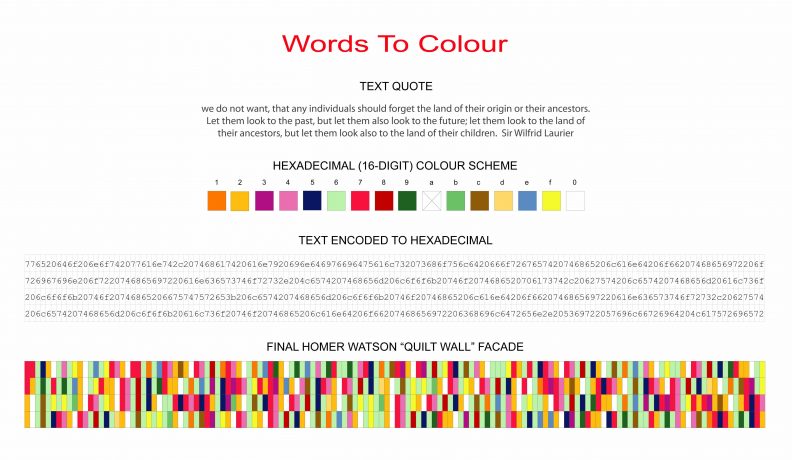
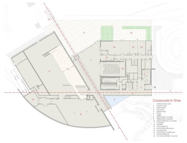
Additionally, on the front entry facade of the museum, the glass panels are imbued with selected images and text that reference the museum’s collection and ‘foreshadow’ the wonderful discoveries that await within. On this facade, the hexadecimal is used to translate the names of the 7 municipalities of the region into color:Cambridge, Kitchener, Waterloo, North Dumfries, Wellesley, Wilmot, and Woolwich.
In comparison to many museums, you use very powerful materials in its interior, striking combination floors and lovely natural textured walls, tell us more about that.
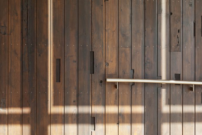
These choices were also informed by regional history. The interior walls of the Huron Hall and the lobby are clad in pine boards reclaimed and re-sawn from a significant local barn that was built in the 1800’s by the family of the very first Mennonite “scouts” to the region - further connecting the museum to local history. The mortise and dowel holes from the original post and beam barn construction are visible in these boards, giving the walls an interesting patina.
“Huron Hall” has black walnut flooring, which is a reference to a local myth of the "trail of the Black Walnut", and how it led the original Mennonite settlers to this region. It also is a reference to the corduroy roads (logs laid side by side) built the early settlers and the fact that originally parts of the Huron Road were corduroy construction.
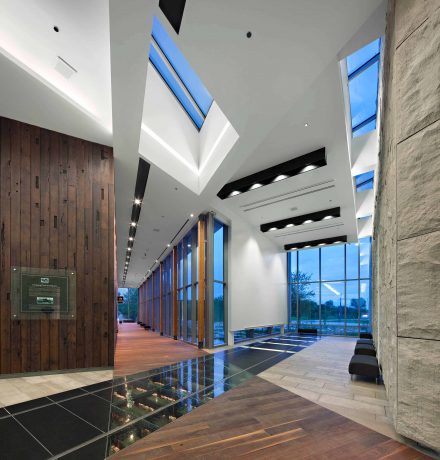
In order to mark the Galt/Elmira Railway and its extension through the lobby, strips of Black granite flooring were used, alternating with under-lit glass flooring to represent the railway ties. Actual railway tracks were extended in as features cast into the floor. This same pattern extends out onto the exterior terrace space.
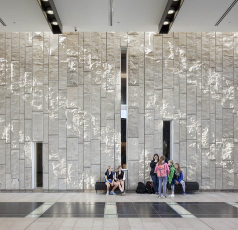
A feature stone wall is aligned with the rail axis and serves to physically mark the memory of the railway within the museum. We used a local split face limestone that is common throughout the region, and was in fact quarried, finished and installed by a local supplier. Sunlight washes down the stone wall through a continuous skylight above. Punched windows through the stone wall give visitors glimpses into the gallery spaces beyond.
What would you say is the most unique feature of this museum design?
It’s a toss-up between the quilt wall and the railway tracks into the museum lobby. The quilt wall makes a bold statement at an urban level, but the tracks are a more intimate feature that most people respond to.
What did you enjoy most working on while creating it?
The interior detailing of the main public spaces was the most satisfying and challenging to work on, especially finding ways to integrate pieces of regional history into the smallest of details. The client really responded positively to the interior design as we continued to develop it and bring elements of it to them for review and approval. Even the structural bases of the columns were designed with the “crossroads” concept in mind.
What would you say is different while designing a museum as oppose to other structures?
More than perhaps any other building type, museums offer the opportunity to immerse oneself in the culture and ethos of a particular subject matter - in this case, the local and regional history. I grew up in the Waterloo Region, but through extensive research on this project, and talking to local historians, artists, industrialists, and politicians, I learned so much more about the region than I ever knew while living there.
Did you feel like it was a challenge designing not only a museum for works of art but also a space for the whole community to interact in? Did you speak to the members of the community?
We had several public presentations during the design phases, and also had members of the public on the client steering committee advisory board. It was clear from the start that this was not only a museum of regional history, but also had a significant community centered focus to it. The client wanted the building to be a “living room” for the community - a place that people would want to return to again and again. As a result, we designed the main public spaces such that they could be used to host events and festivals of varying sizes and types. The main lobby is at the focal point for this, and is interconnected with surrounding spaces such as the galleries, a multi-purpose room, classrooms and a 120 seat theatre - all of which can be expanded into for larger events. In summer, an outdoor terrace supports larger festivals and outdoor events. This is all supported by centrally located food service and catering areas.
Since the museum opened in 2010, they have seen their memberships double and have been blessed with event bookings virtually every weekend of the year.